Text widget in Flutter
Table of Contents
ToggleThe text widget is used to display a short piece of textual information on the App screen. It is part of the Flutter framework widgets and allows you to customize the appearance and style of the displayed text.
The Text can be used to display static text or dynamic text based on user input or Online Data. The flexibility of the Text widget makes it suitable for various use cases, including paragraphs, labels, buttons, and many more.
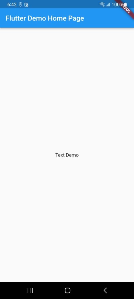
When we run the app in the emulator or device then this view show:

Some essential properties of the Text widget used in our App:
TextAlign: This is used to specify text is aligned horizontally.
TextDirection: We write text from left to right, with the help of this we can change it using this parameter.
Overflow: It is used to determine when the text will not fit in the available space. It means we have specified more text than the available space.
MaxLines: It is used to determine the maximum number of lines displayed in the text widget.
Style: It is the most common property of this widget that allows developers to style the text. It can do styling by specifying by using background color, font size, font weight, letter and word spacing, locale, shadows and many more.
See Example of Text widget in flutter.
import 'package:flutter/material.dart';

void main() {
  runApp(const MyApp());
}

class MyApp extends StatelessWidget {
  const MyApp({super.key});
  @override
  Widget build(BuildContext context) {
    return MaterialApp(
      title: 'Flutter Demo',
      theme: ThemeData(
        primarySwatch: Colors.blue,
      ),
      home: const MyHomePage(title: 'Flutter Demo Home Page'),
    );
  }
}

class MyHomePage extends StatefulWidget {
  const MyHomePage({super.key, required this.title});
  final String title;

  @override
  State<MyHomePage> createState() => _MyHomePageState();
}

class _MyHomePageState extends State<MyHomePage> {

  @override
  Widget build(BuildContext context) {
    return Scaffold(
      appBar: AppBar(
        title: Text(widget.title),
      ),
      body: Center(
        child: Text("Text Demo")
      ),
    );
  }
}
